project | 2000
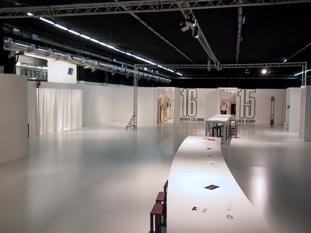
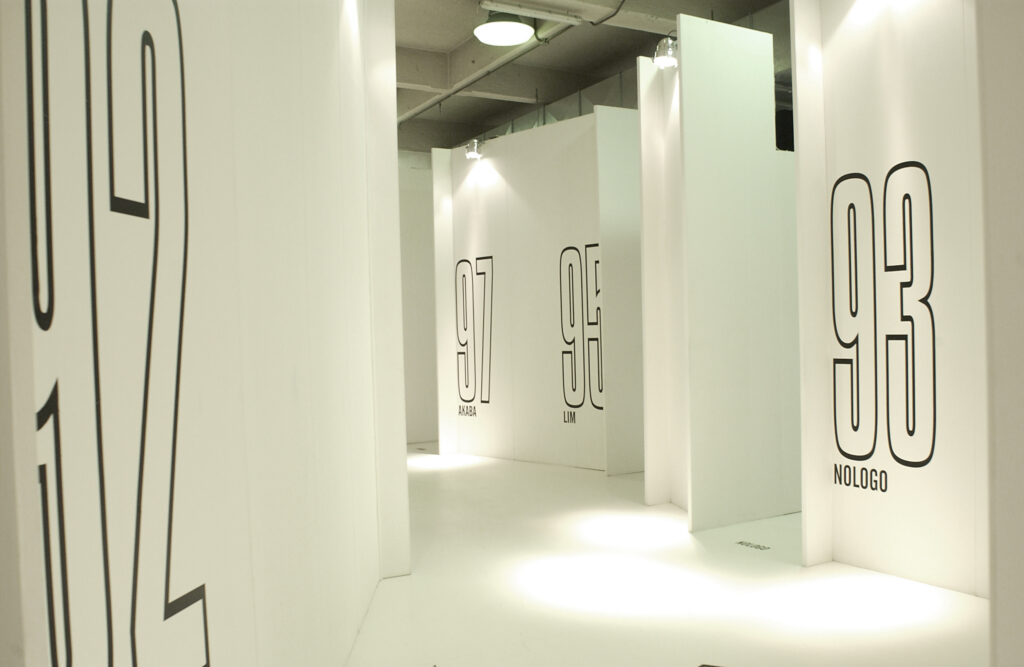
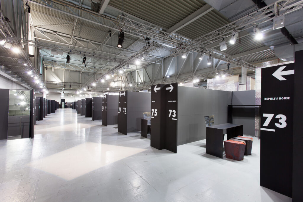
small “houses/showrooms” alongside each other, each with its own entrance. Big black numbers create a contrasting graphic effect background’s total-white wall
project | 2001
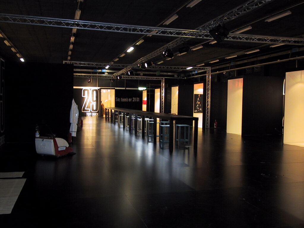
a black aisle with a long table at the centre. the neon light enhances the metallic colors of the stools. spaces reserved to the display of collections
project | 2002
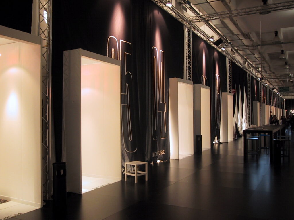
impressive curtains – five meters in height – create plays of colors of white and black. the entrance to the stands is framed by wooden portals
project | 2003
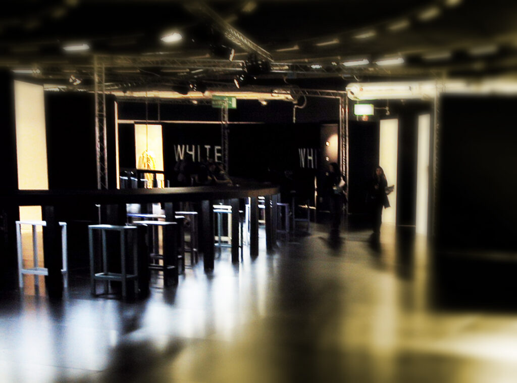
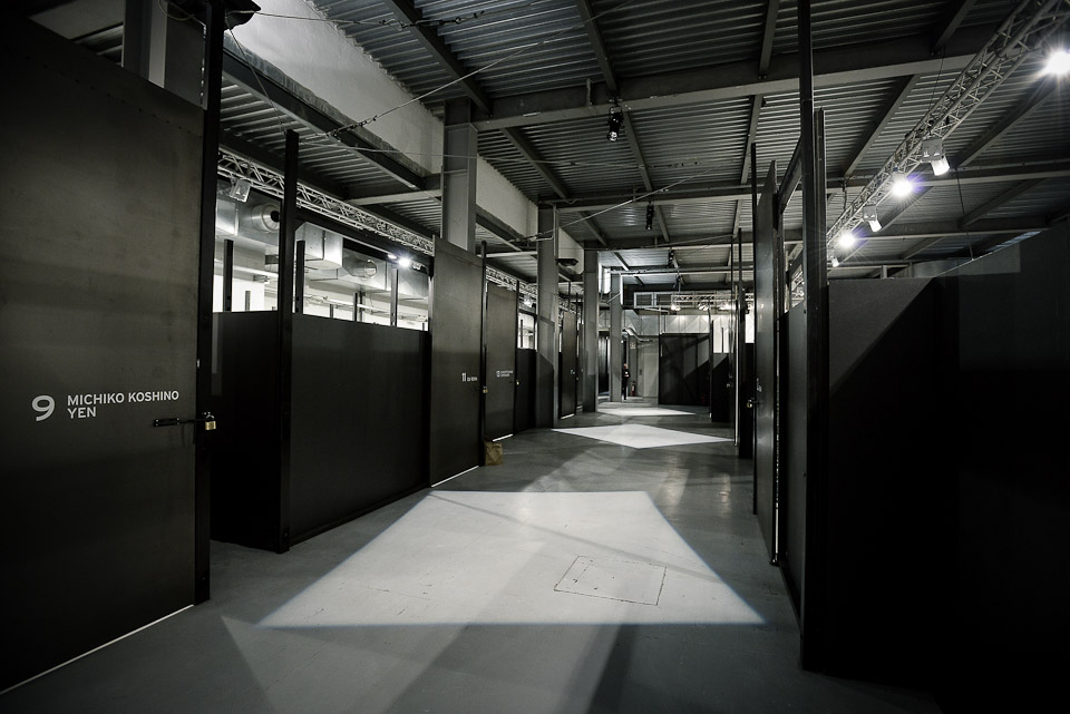
the fixed route is born. a long aisle that hides new showrooms behind every corner. circles of light permeate the path
project | 2004
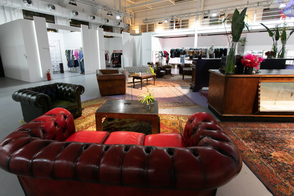
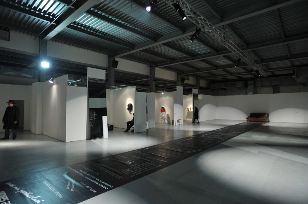
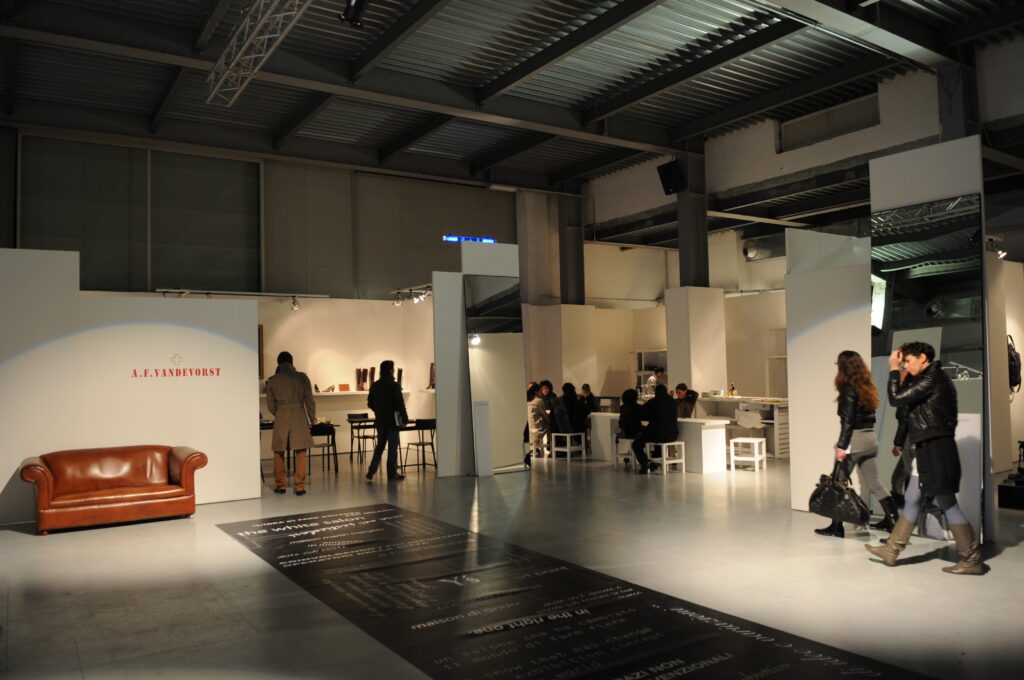
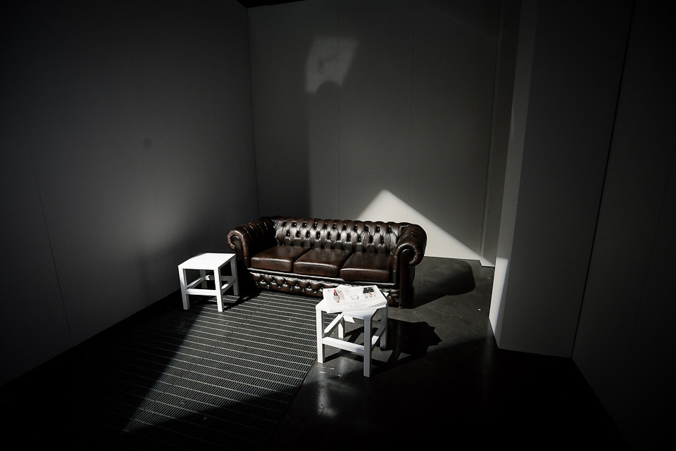
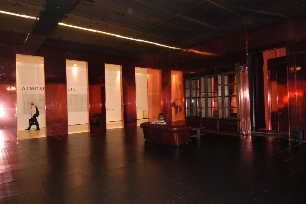
concrete-like walls, leather sofas, graphic inscriptions on burnished iron plates, suffused light that accompanies the visitor through a typically “underground” aisle
project | 2005
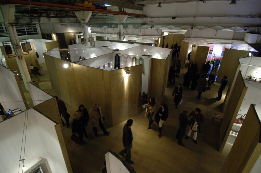
the layout is conceived like a big patchwork of stands with articulated shapes that enable exploiting the available spaces at best. no more unvaried stands, but spaces that are unlike each others
project | 2006
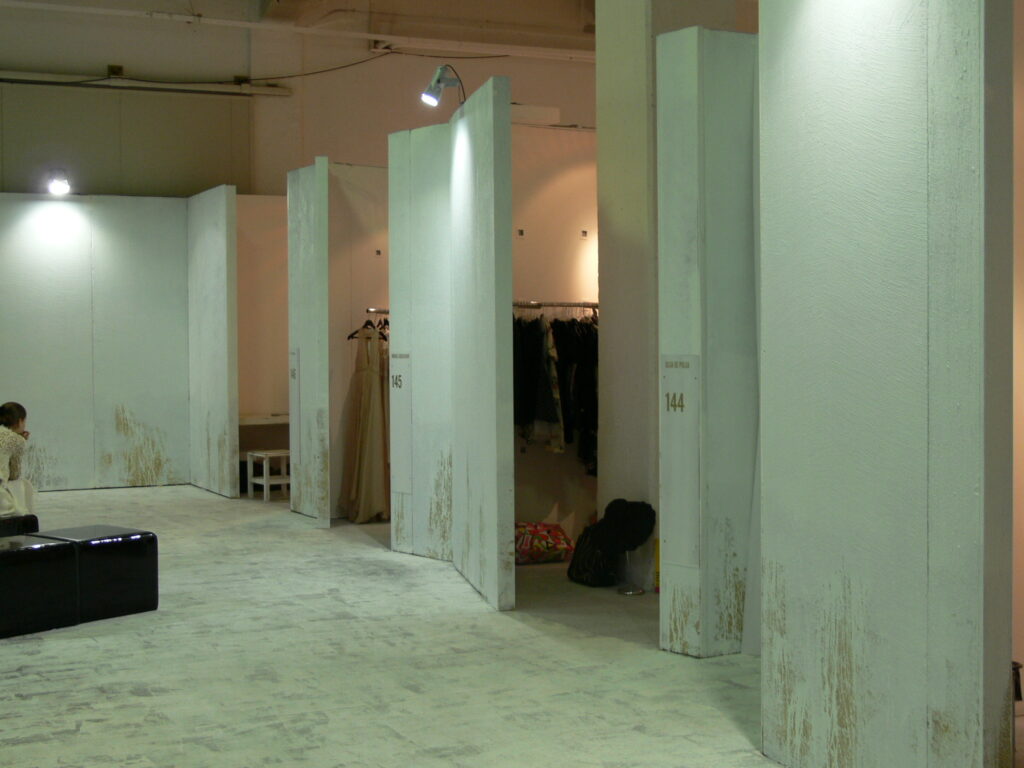
the idea of recycling is born. the fitting-outs realized for other exhibitions are adapted to other shows thus limiting the waste of raw materials
project | 2007
the first zero-impact show. pulp furniture is transformed into design pieces, old panels become tables, lids of cardboard boxes turn into stand inscriptions
project | 2008
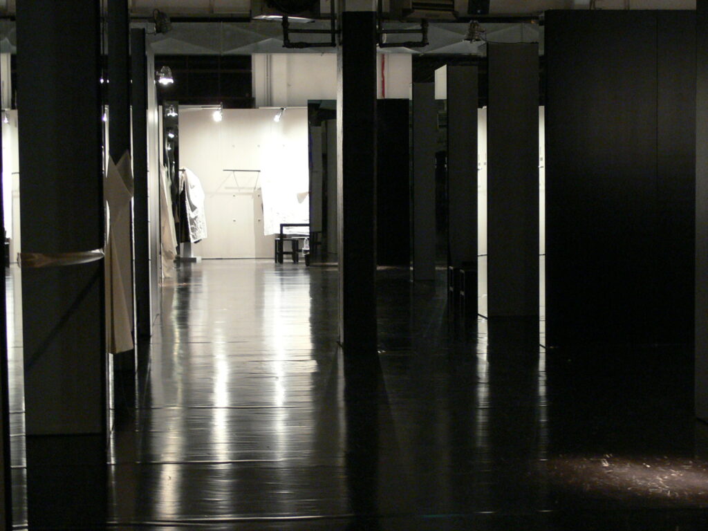
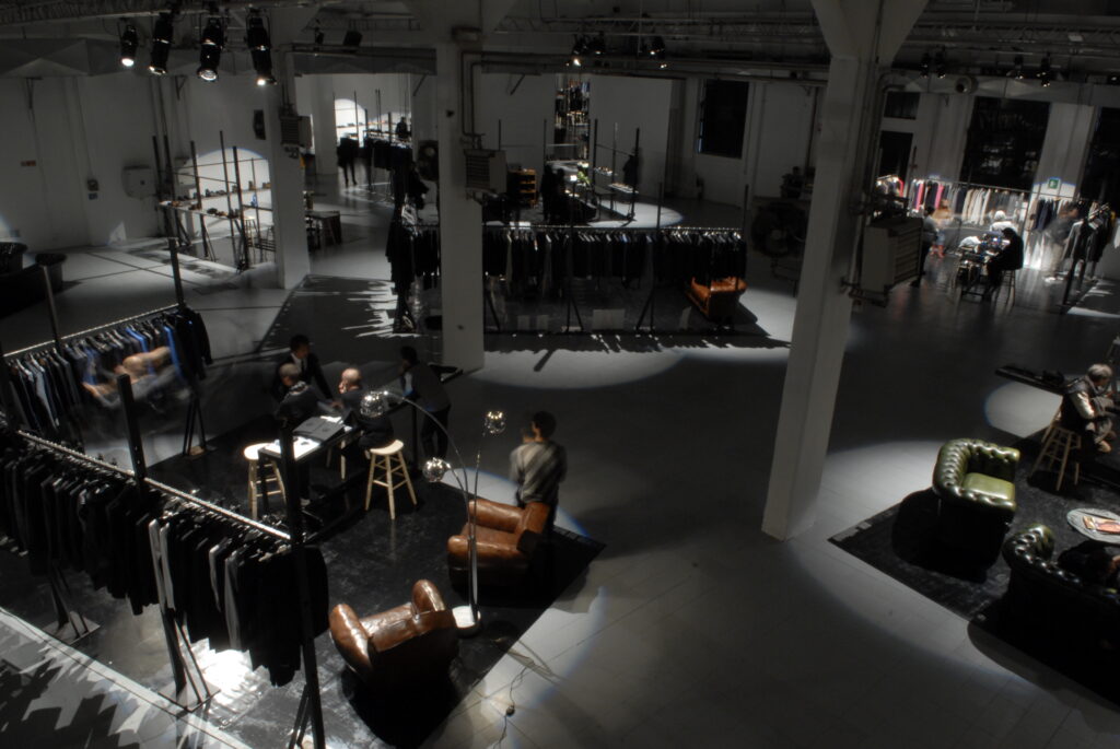
open space setting-out, spaces defined by light with no visual barriers. the stands become intimate living-rooms to welcome visitors
project | 2009
atmosfere lights enhance the original and scenic industrial-inspired location
project | 2010
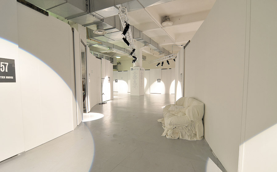
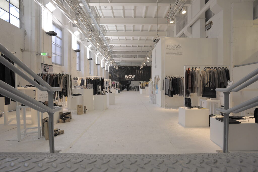
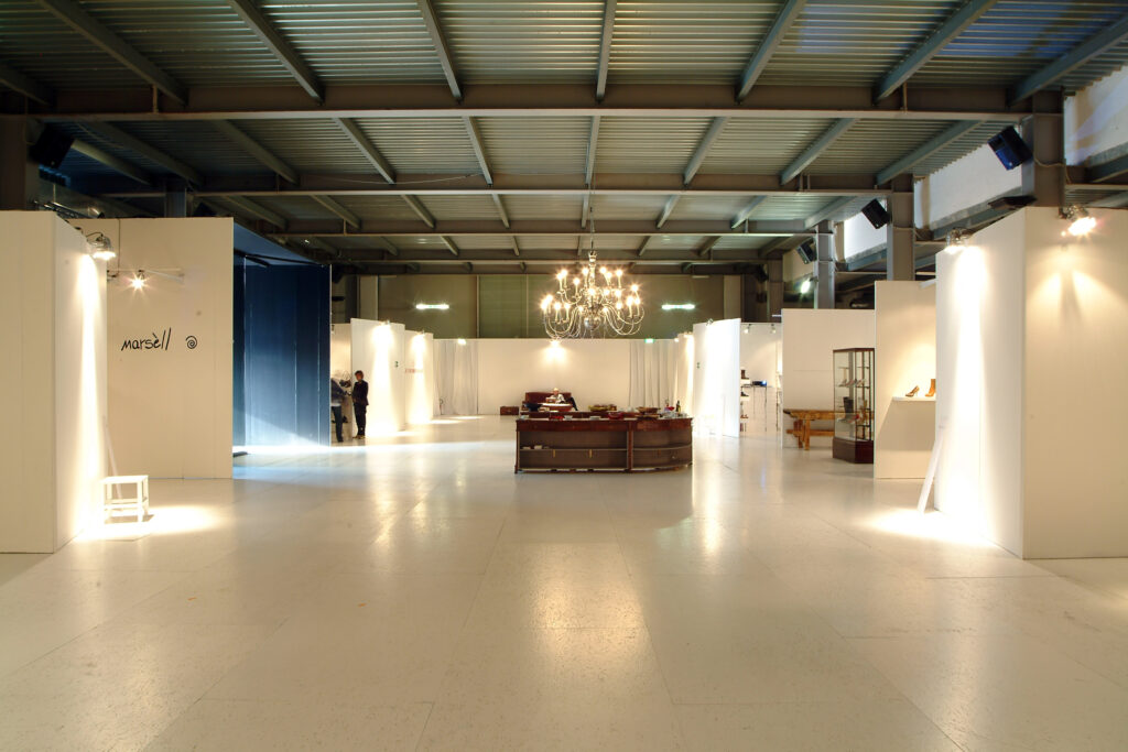
total white, clean appearance and essentiality of the lines. the show’s cornerstone, translated in setup language
project | 2011
wow – white on web is born. a neat and linear setup that highlights the brand’s creations
project | 2012
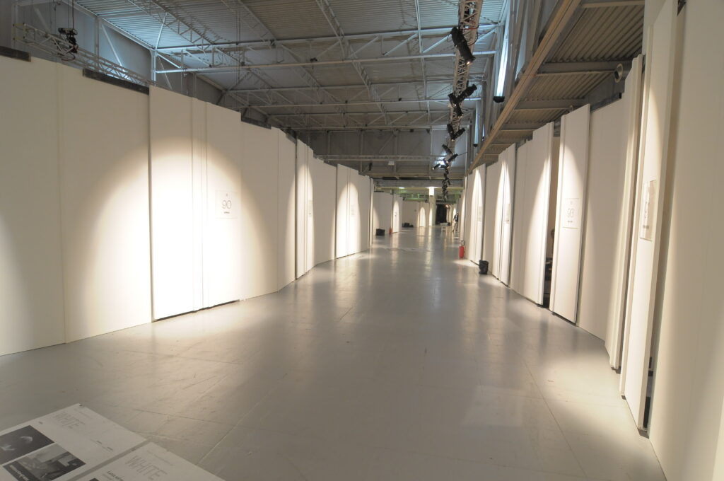
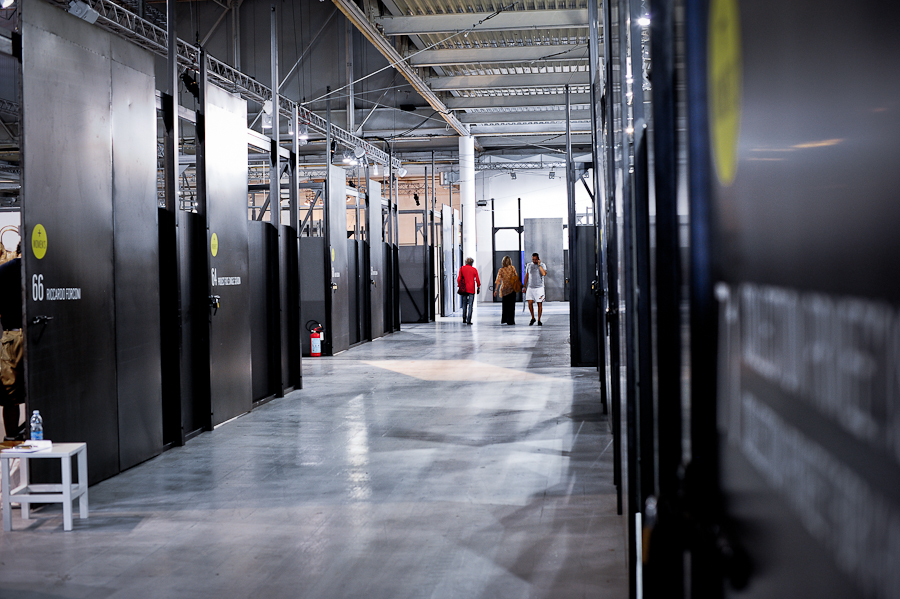
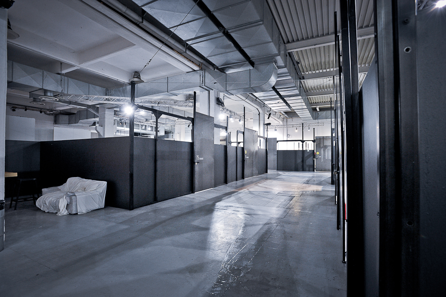
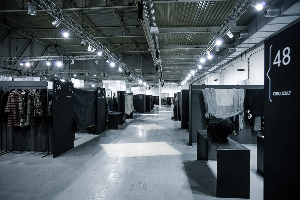
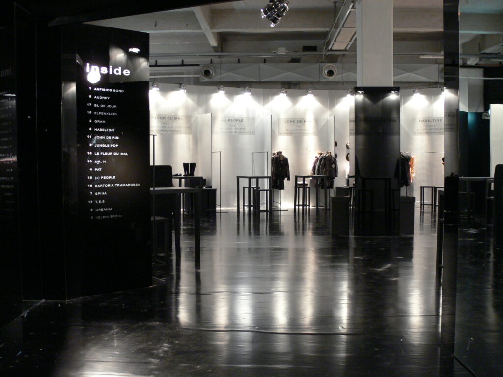
protagonists of the edition are total-black and metallic colors
project | 2013
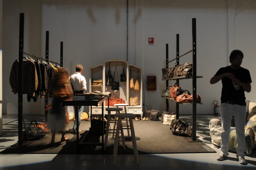
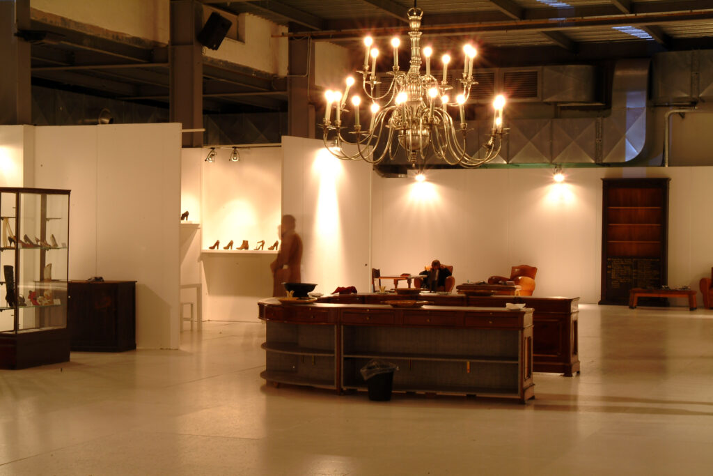
vintage furnishing placed in a minimalistic context. height plays add value to the spaces
project | 2014
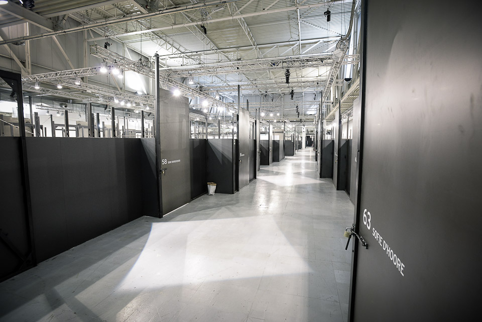
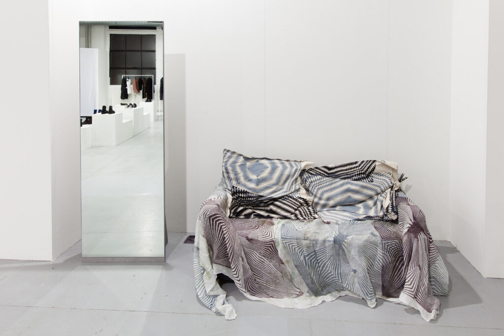
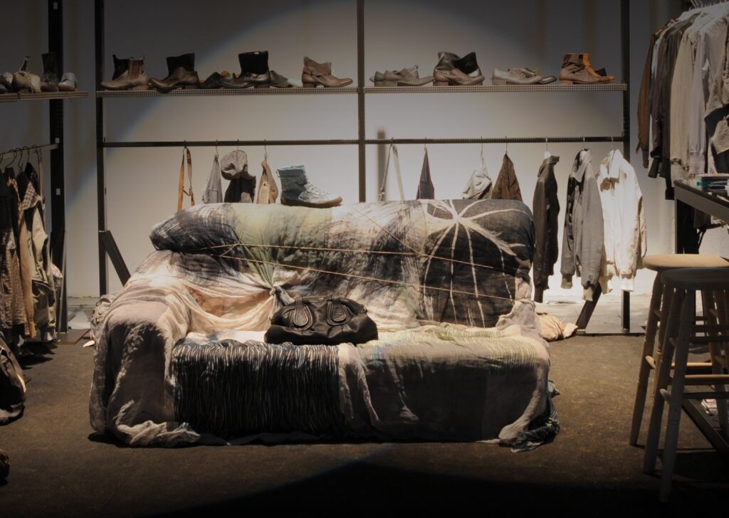
decorative elements take over, among which are mirrors that amplify the space. subentrano elementi decorativi, tra cui specchi che amplificano lo spazio. hand-painted canvases brighten the seats
project | 2015
the setup is played on the contrast generated by black and white, by the industrial and the shabby styles
project | 2016
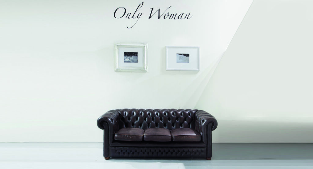
essentiality dominates the locations of the show and enhances the collections
project | 2017
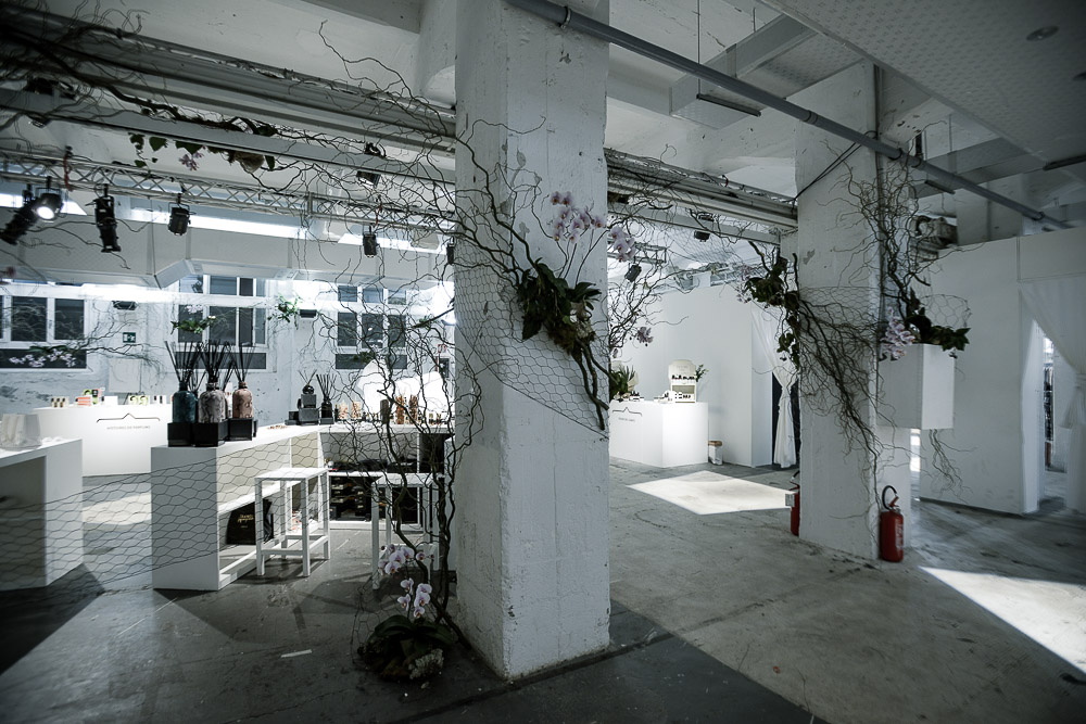
unique spaces that alternate between strong nuances and natural colors
project | 2018
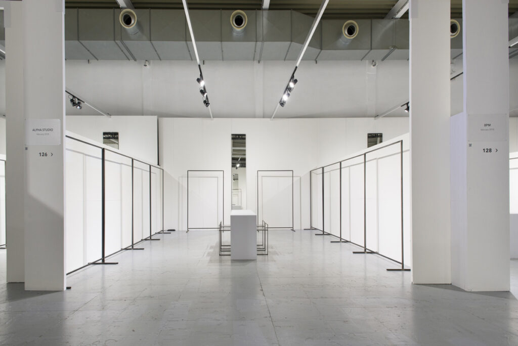
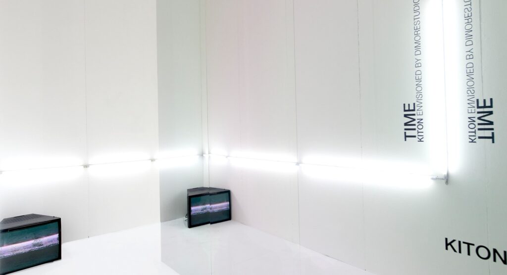
the color white and optical lighting are back. in ethereal and timeless spaces
project | 2019
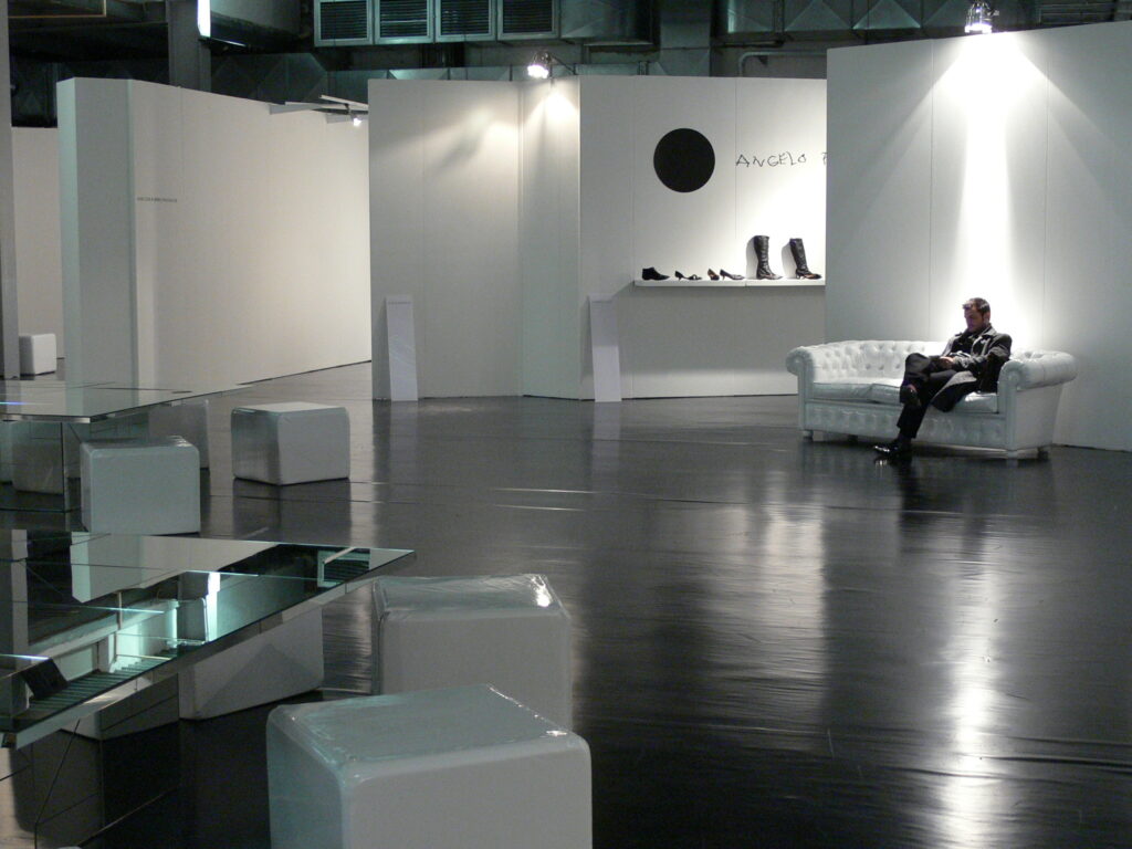
a black floor is in contrast with white walls and ceilings, American lights give depth to the spaces.
project | 2020
modern furnishing components and mirror tables accompany an essential space
project | 2021
geometric shapes and heights create eye-catching effects, harmonious with new and innovative installations
project | 2022
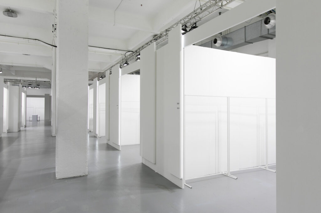
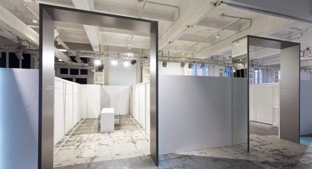
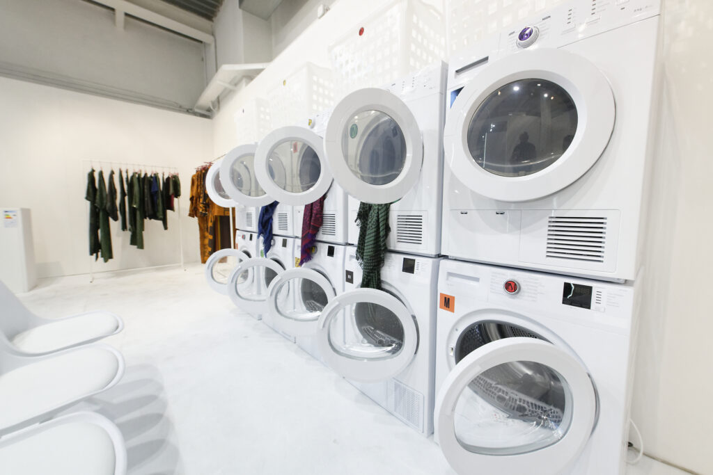
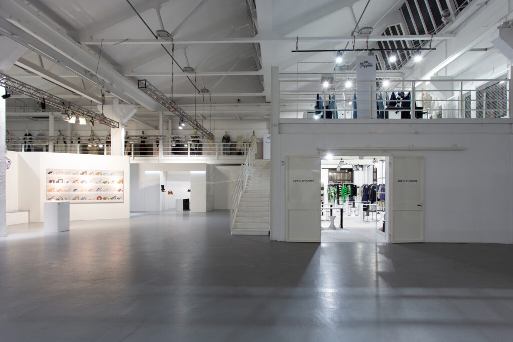
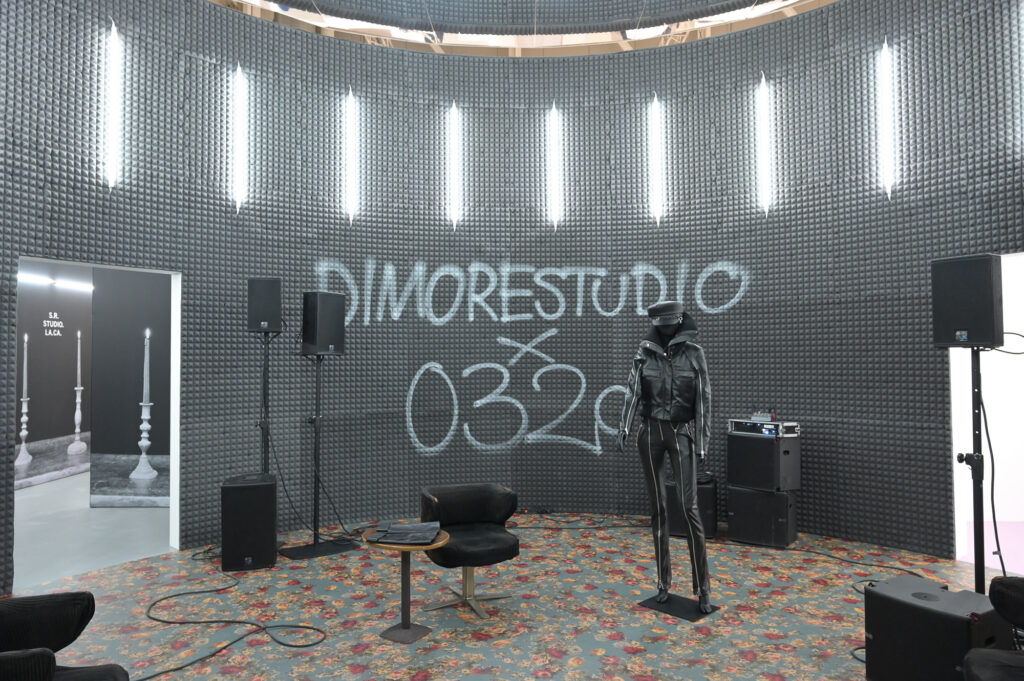
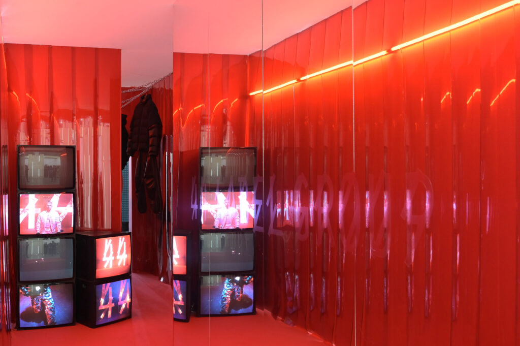
the secret rooms are back: exclusive exhibition spaces defined by a great sense for design and with an original touch
project | 2023
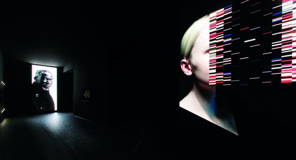
a sleek and elegant tunnel un tunnel brings the visitor to a pristine and minimalistic hub
